Admin: Corporate Admin
Page: Dashboard
URL: [CLIENTID].corpadmin.directscale.com/Corporate/Dashboard
Permission: ViewSales()
The Dashboard provides you with a snapshot of your sales, enrollments, ranks, and other data for the selected period.
Dashboard Features
Period Selector
At the top of the dashboard is a period selector that allows you to view the dashboard data for the following periods:
- This Month
- Last Month
- This Week
- Last Week
- Today
- Yesterday
| Weekly periods begin on Sunday and end on the following Saturday. |
Select the desired option from the drop-down menu and the data will change to reflect the chosen period.

Breakdown Reports
Widget Descriptions
Each widget has an information icon next to the title. When you hover over that icon it will explain the widget data.
Data Caching
Sales History data may be cached for up to 60 minutes. All other Dashboard data may be cached for up to 5 minutes. This means that refreshing the page won't necessarily update the data. You will need to wait for the cache to refresh. Having the data cached allows the system to quickly load large data sets.
Currency
The sales amounts shown are in USD regardless of the inventory item currency type. The currency type is converted to USD using the Exchange Rate entered on the Currency page. This allows you to compare all of your sales data together and view data on your business overall.
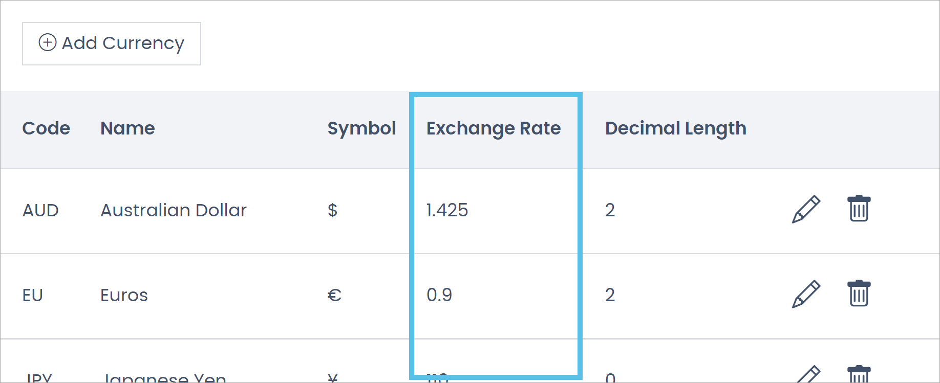
Order Data
Order data on the dashboard represent subtotals from orders. Discounts, taxes, and shipping are removed from sales totals on the dashboard. Refunds are not removed from sales totals.
Change Percentages
The change percentage, along with the green up or red down arrow, gives you a quick way to see if that specific data point is trending up or down compared to the previous period.
For example, if you are comparing This Month to Last Month and it's 5 PM on July 10th, the change percentage compares this month's orders to last month's orders up until 5 PM on June 10th (the same elapsed time as the current period, not the entire month of June). So, if there is positive growth (green up arrow), then that means you’re doing better in July compared to the same point in time for June.
When viewing for This Week, the change percentages compare this week with last week. When viewing for Today, it compares today with yesterday.
Dashboard Widgets
Sales Widgets

The sales widgets show your total sales combined, as well as by order type, for the selected period. Each sales widget tells you the number/count of orders, how much money those orders are worth, as well as the change percentage. Total Sales is a combination of Enrollment + Autoship + Standard orders, each of those referring to the different order types that can be associated with an order. The breakdown report will show you all of the orders that make up the sales number.
- Total Sales - Includes all order types.
- Enrollment Orders - Includes orders where OrderType = 3 (enrollment).
- Autoship Orders - Includes orders where OrderType = 2 (autoship).
- Standard Orders - Includes orders where OrderType = 1 (standard).
Read more: Understanding Order Types
Sales History
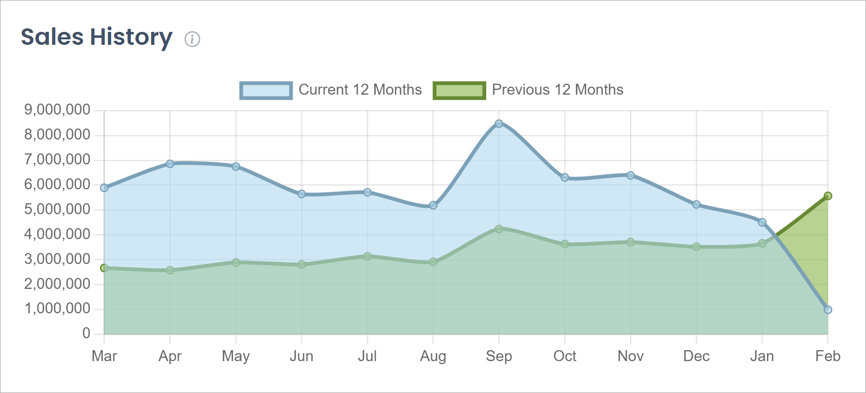
This graph displays the month-to-month sales trends for the current rolling 12 months compared to the previous rolling 12 months. Hover over the graph to see monthly totals for current and previous.
| You can click on an option in the key/legend to hide/show part of the data. For example, clicking on "Previous 12 Months" will hide that option from the graph and automatically adjust the graph to the remaining data set visible (Current 12 Months). |
Sales History by Order Type
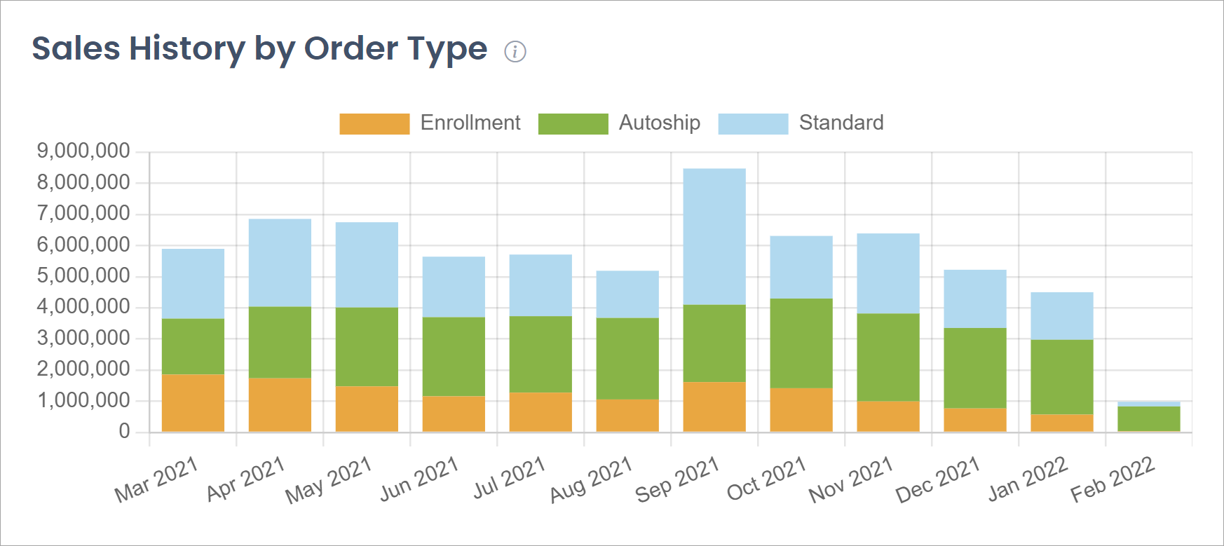
This bar chart shows the month-to-month sales trends for the current rolling 12 months but breaks them down by order type. Hover over the graph to see monthly totals by order type.
| You can click on an option in the key/legend to hide/show part of the data. For example, clicking on "Enrollment" and "Autoship" will hide both of those options from the graph and automatically adjust the graph to the remaining data set visible (only Standard orders). |
Country Sales
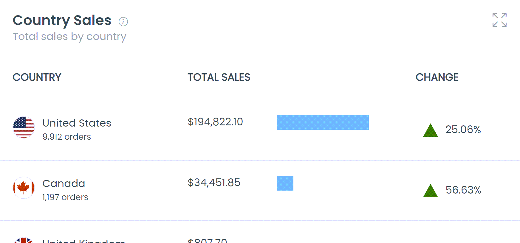
This widget shows the top 6 countries with the most total sales for the period selected, based on the Countries you have configured. Included in the widget are the number of orders, total sales amount, and the percent of growth change. The blue horizontal bar is a visual representation of the number of sales each country represents compared to the combined total.
Only the top 6 countries are shown in the widget, but you can view the full list in the breakdown report.
Product Sales
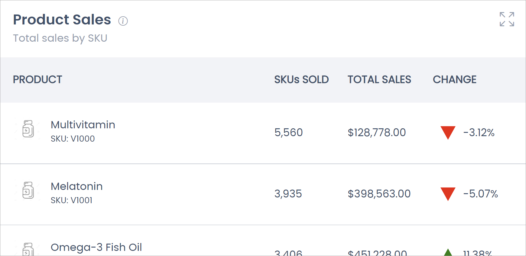
This widget shows the top 6 products sorted by the number of SKUs sold. Included in the widget are the number of SKUs sold, the total sales amount for those SKUs sold, and the percent of growth change. This is a total across all warehouses that sell the product.
Only the top 6 products are shown in the widget, but you can view the full list in the breakdown report.
Top Enrollers
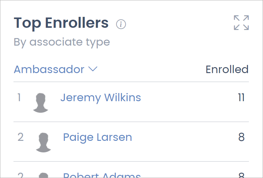
This widget shows the top 10 enrollers for each of your associate types. Top Enrollers are determined by the number of level 1 enrollments in the Enrollment Tree. Use the associate type drop-down to change the selection. The "Enrolled" number is how many level 1 enrollments that person has for the selected associate type in the selected period. The number to the left of the names is their ranking in the top 10. If users share the same ranking that means they have the same "Enrolled" number.
Only the top 10 enrollers are shown in the widget, but you can view the full list of enrollers in the breakdown report.
Average Order
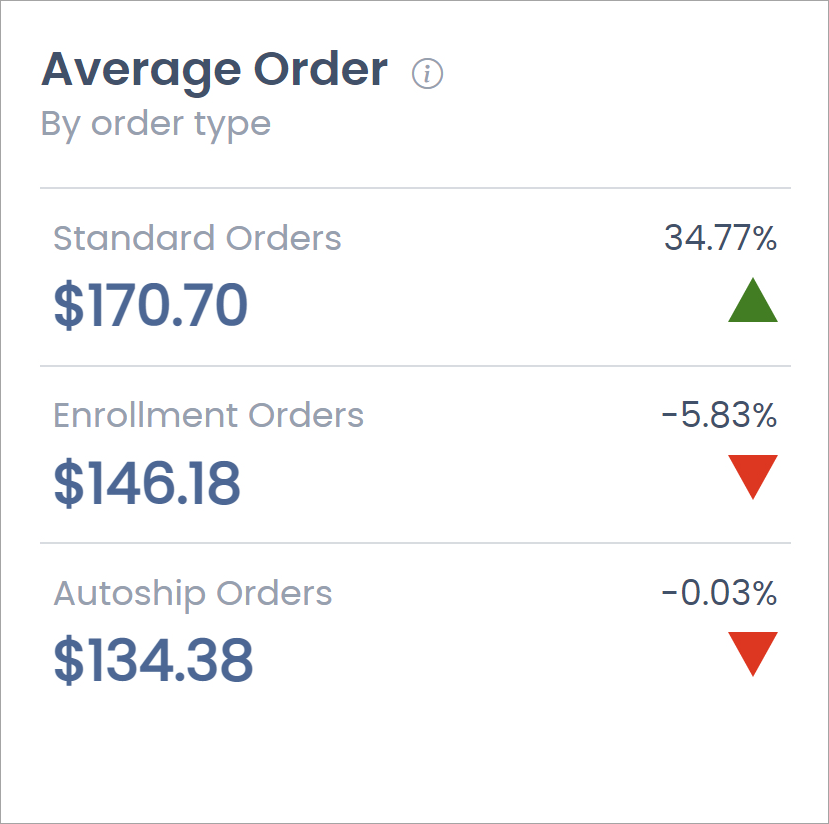
This widget shows the average order amount by order type. Like all other data on the dashboard, the average order amount is calculated from the order subtotal, with discounts, taxes, and shipping being removed from the total. Refunds are not removed from totals.
New Associates
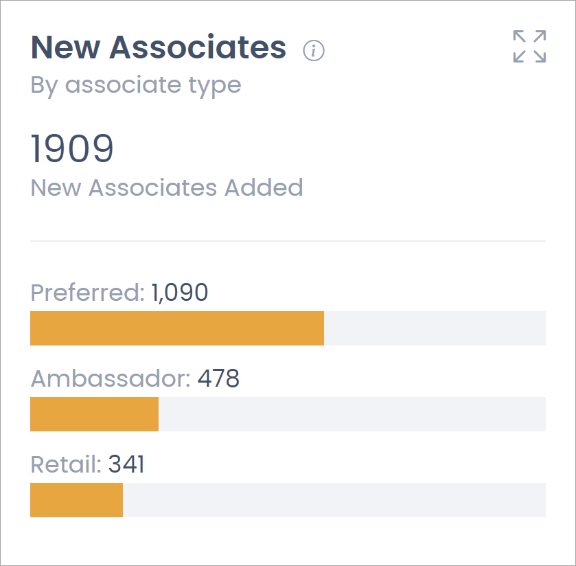
This widget shows the number of new associates that have been created during the period selected, by associate type.
Rank Counts
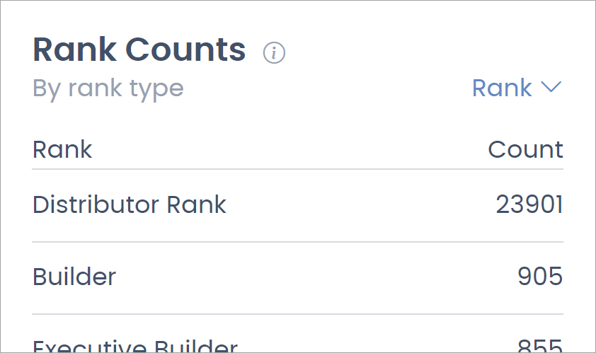
This widget shows the number of associates at each rank, by rank type. Use the drop-down to select the desired rank type between current, paid, and highest rank. The drop-down option names may differ based on your configured nomenclature.
| The rank counts widget data is not affected by the period selector. |
Comments
Please sign in to leave a comment.